
Great Graphs—Tell Your Nonprofit’s Story With Engaging Data Visualization
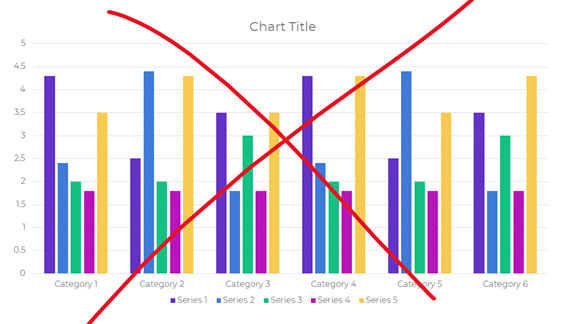 Are your takeaway findings getting lost? Bad graphs can slow down the viewer’s comprehension, increase cognitive load, and fail to inform decision-making processes.
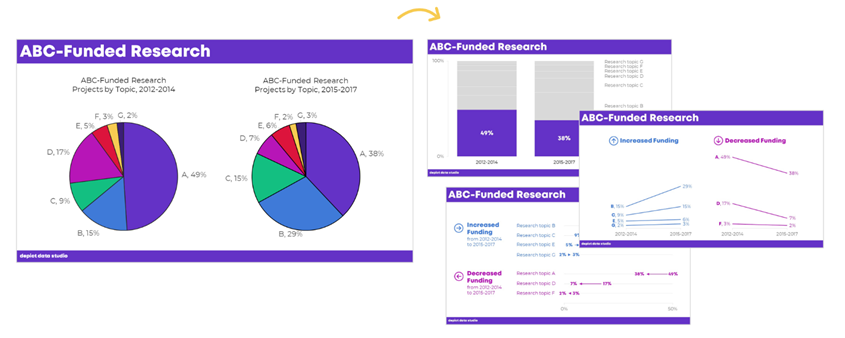
Dusty shelf reports aren’t inevitable. With intentional editing, you can design visualizations that inform and inspire.
 Data visualization isn’t supposed to feel daunting. In this 90-minute live webinar, Ann K. Emery will walk you through a step-by-step design process so you can apply critical thinking skills to your own projects. You’ll learn how to:
- customize your visualization for your audience;
- choose the right chart for your message;
- go beyond the bar chart;
- declutter your visuals so that the viewer’s attention is focused on the data;
- reinforce your branding with custom color palettes and typography;
- increase accessibility by ensuring that your visuals are legible for people with color vision deficiencies; and,
- explain your takeaway findings with explicit titles and annotations.
Who said data has to be boring?
The webinar includes:
- 90 minutes of live instruction in a small group setting;
- a link to stream the recording so you can re-watch your favorite techniques;
- examples specific to your grantmaker/grantee setting;
- a PDF’d copy of the slides; and,
- a ten-page handout to guide your future data visualization work.
No fancy software needed. This is a best practices course, not a software how-to course. You won’t see lessons about “First, click this button” and “Then, click this button.” That being said, you’ve got to use some software program. All the training examples have been made with everyday software you already own, like Excel, PowerPoint, Word, and other low-cost tools. You don’t have to be a computer programmer or a graphic designer to be a great communicator.